Martin Salgado

Design portfolio

Sites that have to sell something technical to someone careful.

Six live sites and the resources built around them. Most of this work sits in the same narrow place: a technical product or a specialist consultancy, an audience that reads closely and distrusts polish, and a page that still has to do the job of a salesperson.

Each entry below records what the site had to do, the design decisions that answer it, and the tokens the build actually ships. Everything is live — the links go to the running site, not a case-study mockup.

Live sites
6
Designed resources
6
Build stacks
Astro · React · hand-built HTML

Web

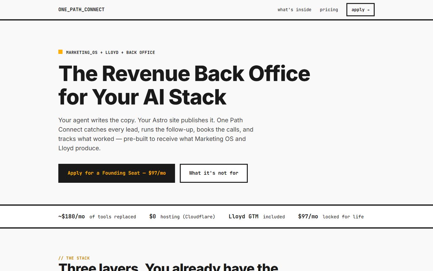
One Path Connect homepage: heavy black headline reading The Revenue Back Office for Your AI Stack on near-white, with an amber accent square and monospace navigation.

01

One Path Connect

onepathconnect.com ↗

A subscription product page for the CRM, follow-up and attribution layer that sits behind an AI agent — sold to operators who build in code.

The aesthetic is deliberately tooling, not marketing: monospace labels, section kickers set as comments (// THE STACK), square corners, and 2px hard rules doing the work that drop shadows usually do. One amber accent carries every signal on the page.

The palette ships a second pair of tokens — --amber-readable and --green-readable — because the phosphor green and amber that make the interface look like a terminal fail contrast as body text. The bright pair is for marks and fills; the muted pair is for anything that has to be read.

  • Stack Astro 5 · static · Vercel
  • Type Grotesk display · monospace UI
  • #1A1A1A
  • #F9F9F9
  • #FFB000
  • #39FF14
  • #C98A00
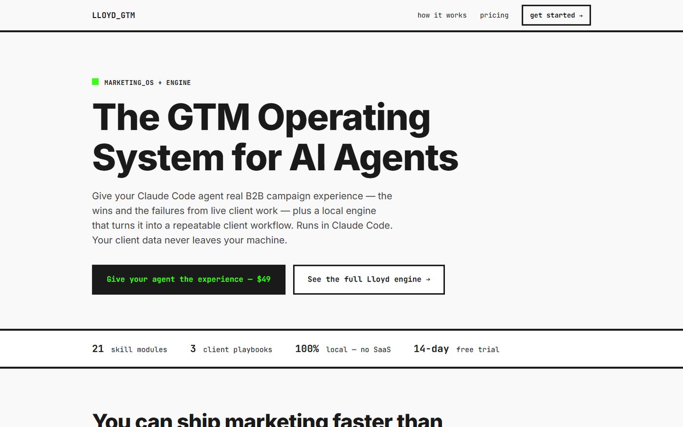
Lloyd GTM homepage: large black headline reading The GTM Operating System for AI Agents, with monospace navigation and an amber marker.

02

Lloyd GTM

lloydgtm.com ↗

Product site for a GTM engine and skills library that runs inside a developer's own repo.

Lloyd and One Path Connect share one design system — the same ink, paper, amber and green tokens, the same monospace kickers — because they are sold as layers of one stack and a buyer crosses between them. Holding the two sites in a single language is the point: the seam between products should not look like a seam between companies.

What separates them is structure rather than style. Lloyd leads with terminal blocks ($ lloyd init --client acme) as its primary evidence, numbers its three steps, and closes on a tag cloud of shipped skills — proof by artifact, for an audience that would rather read a command than a claim.

  • Stack Astro · static · Vercel
  • Type Grotesk display · monospace UI
  • #1A1A1A
  • #F9F9F9
  • #FFB000
  • #39FF14
  • #787878
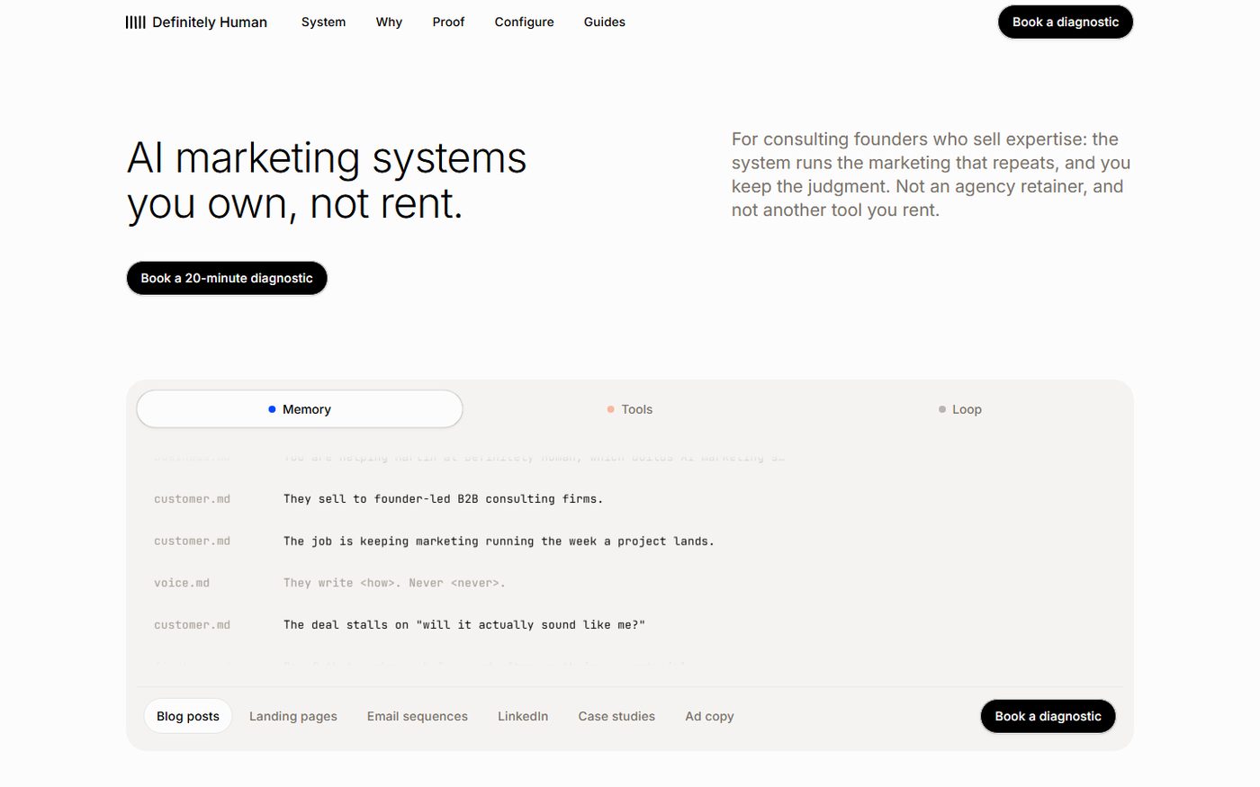
Definitely Human homepage: cream editorial layout, light-weight headline reading AI marketing systems you own, not rent, above a product panel showing a workspace file tree.

03

Definitely Human

definitelyhuman.xyz ↗

Marketing site for AI marketing systems a client owns outright rather than rents from a vendor.

The most tightly specified system here. Nine named surface and text tokens, no raw hex permitted in a component, hairline borders instead of shadows, pill radius fixed at 9999px, and a display face locked at weight 300 — bolding it is written into the rules as the one thing that destroys the signature. Light theme only, because the reference defines no dark tokens and inventing them would mean inventing colour.

Two accent sparks, a blue and an orange, are allowed only inside product artwork — never a button, link, badge or border. And the product evidence is built rather than photographed: a workspace rendered as a file tree, and a before/after diff showing the same prompt against the same model with different context. A page with no visual evidence does not ship.

  • Stack Astro 5 · zero JS by default · Cloudflare Pages
  • Type Light grotesk display · mono for metadata only
  • #FDFCFC
  • #F5F3F1
  • #EBE8E4
  • #44403B
  • #0447FF
  • #FF4704
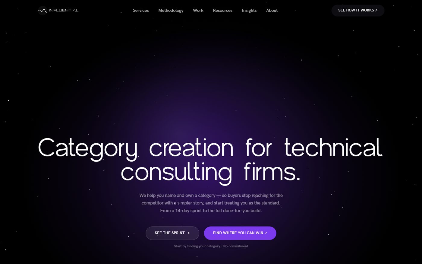
Influential B2B homepage: near-black starfield hero with a wide light headline reading Category creation for technical consulting firms and a violet call-to-action button.

04

Influential B2B

influentialb2b.com ↗

Positioning site for a demand agency that names and builds categories for technical consulting firms.

The darkest and most atmospheric of the set, and the only one that spends real budget on motion. A near-black canvas, a violet ramp from #6D28D9 to #8B5CF6, and a drifting starfield behind a very large, very light grotesk. The offer is premium and consultative, so the page is allowed to feel like an argument rather than a spec sheet.

Restraint shows up in the ladder rather than the surface. The hero states the category, the next screen names the pain in the buyer's own sentence — "we couldn't explain your solution" — and only then do four tiers appear, each with its own duration and deliverable. Scroll is smoothed with Lenis and sequenced with GSAP so the argument arrives in order.

  • Stack Astro 5 · React · GSAP · Lenis · Vercel
  • Type Wide light grotesk display
  • #000000
  • #0D0D12
  • #6D28D9
  • #7C3AED
  • #8B5CF6
  • #FAFAFA
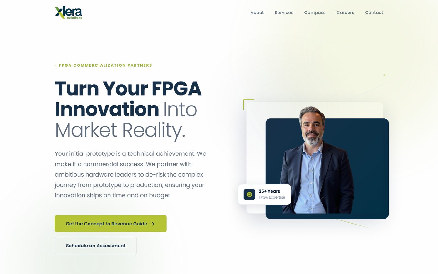
Xlera Solutions homepage: navy headline reading Turn Your FPGA Innovation Into Market Reality beside a portrait card of the founder and a 25+ years expertise badge.

05

Xlera Solutions

xlerasolutions.com ↗

Homepage and resource system for an FPGA commercialization consultancy selling to engineering directors and CTOs at once.

Deep navy and a lime accent — industrial, closer to test equipment than to SaaS. The whole site is built as self-contained HTML with every rule inline, because it is hosted inside GoHighLevel and has to survive a CMS that will not carry a stylesheet. That constraint shaped the system: few components, reused hard, no external dependencies to break on paste.

The homepage went through four passes, and the last one was an honesty edit rather than a visual one. A team section implying staff the firm does not have was cut and replaced with a principal-led model — an expanded founder biography and a specialist-network diagram. Losing the stock headshots cost the layout its easiest block of visual interest and made the page considerably more credible.

  • Stack Hand-built HTML/CSS · inline assets · GoHighLevel
  • Also Brand guidelines — voice split by audience, engineer vs. executive
  • #023146
  • #173048
  • #B5C435
  • #9AAD2B
  • #F9FBFD
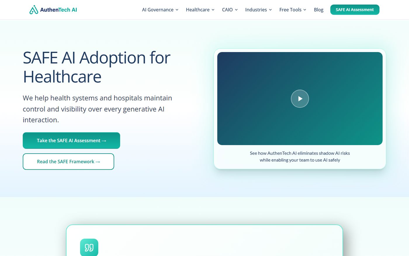
AuthenTech AI homepage: white layout with teal headline reading SAFE AI Adoption for Healthcare, teal buttons and a navy-to-teal gradient video card.

06

AuthenTech AI

authentech.ai ↗

Positioning and governance site for healthcare AI compliance, read by clinical, legal and procurement staff in the same week.

Clinical teal on white. The palette has one job before it has any other: look trustworthy to a compliance officer. Saturation stays low, the surface stays near-white (#F0FDFA), and navy carries the headings so nothing on the page reads as a startup trying to be exciting about regulated data.

The token set carries a swappable accent — teal, blue, violet and amber variants of the same primary/light/dark triple — so industry and topic sections can shift hue without leaving the system. Underneath, the content is unusually dense for a marketing site: a four-layer framework, a six-week pilot broken into three stages, and a long FAQ. Cards, hairline borders and generous whitespace keep it scannable instead of heavy.

  • Stack Astro · Cloudflare
  • System Themeable accent triple across four hues
  • #0F766E
  • #0D9488
  • #14B8A6
  • #1E3A5F
  • #F0FDFA

Resources

Playbooks, comparison pages and offer pages designed alongside the sites — the pieces a buyer actually leaves with.

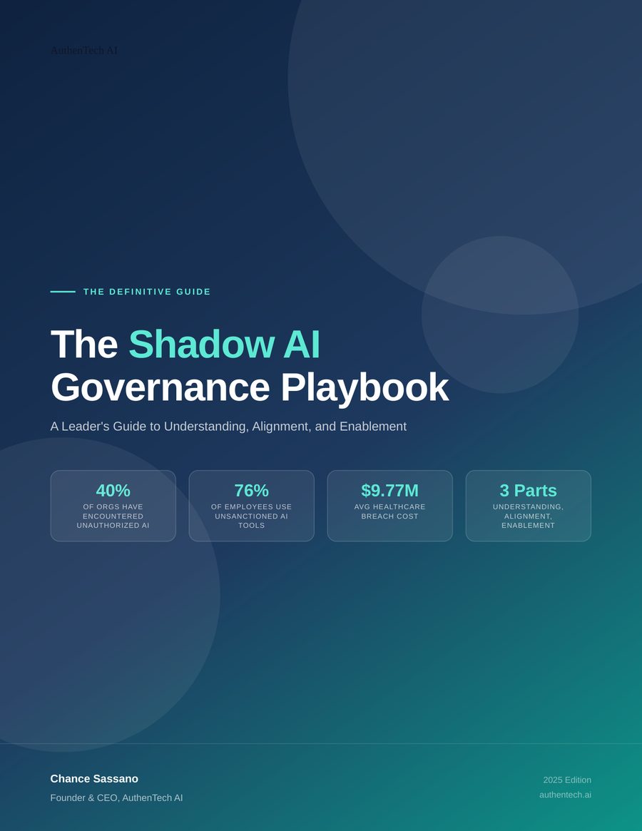
Cover of The Shadow AI Governance Playbook: navy-to-teal gradient with large soft circles, four statistic plates and the author credit.

AuthenTech AI

The Shadow AI Governance Playbook

A 29-page leader's guide. The cover carries the whole brand argument in one frame — navy-to-teal gradient, oversized orbital shapes, and four stat plates that give a skimming executive the stakes before the contents page. Interior runs the three-part structure the site also teaches, so the download and the site reinforce one another.

  • 29 pages
  • PDF
  • Cover + interior system
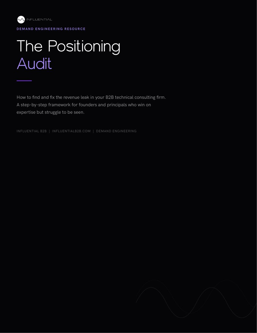
Cover of The Positioning Audit: black page, Influential wave mark, violet accent on the word Audit, and a faint waveform at the foot.

Influential B2B

The Positioning Audit

An 8-page framework document that keeps the site's language exactly. Black field, the wave mark small at the top, a violet rule and a single violet word carrying the whole accent budget, and the brand's waveform ghosted into the foot of the page. Nothing on the cover but the title, the promise and who it is for.

  • 8 pages
  • PDF
  • Lead magnet
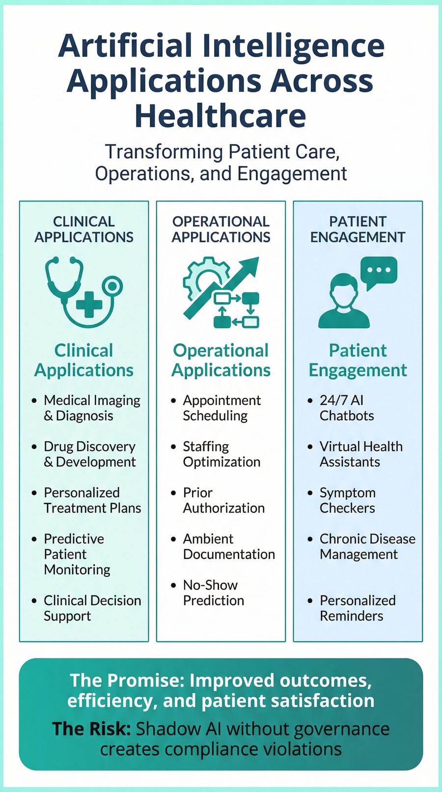
Infographic titled Artificial Intelligence Applications Across Healthcare with three tinted columns for clinical, operational and patient engagement uses.

AuthenTech AI

AI Applications Across Healthcare

A three-column infographic mapping clinical, operational and patient-engagement uses, each column tinted a step along the teal ramp so the categories separate without borders doing the work. It closes on the promise/risk pair that sets up the governance offer.

  • Infographic
  • Social + in-page
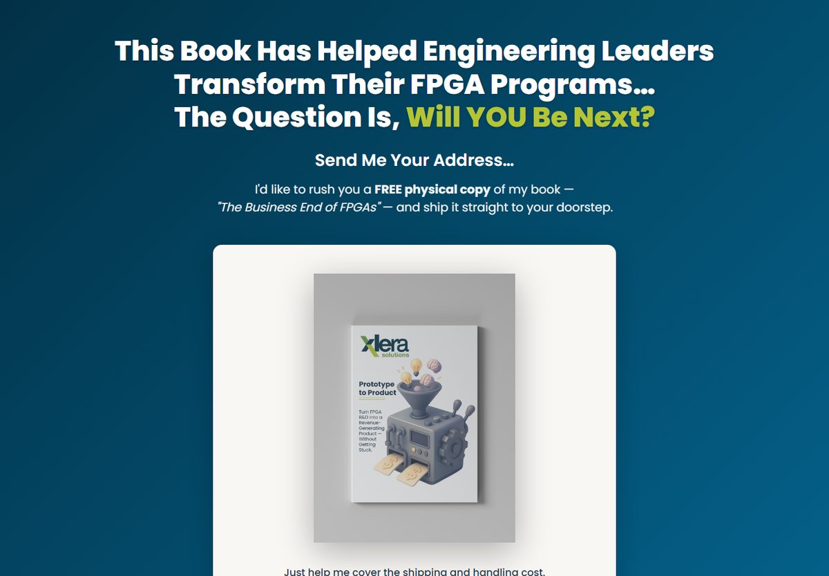
Xlera book offer page: deep navy background, white headline, and a rendered copy of the book The Business End of FPGAs on a light card.

Xlera Solutions

The Business End of FPGAs

A free-plus-shipping book offer page. Navy field, one product render carrying the visual load, and the ask reduced to an address field. The headline does the qualifying so the form does not have to.

  • Offer page
  • Self-contained HTML
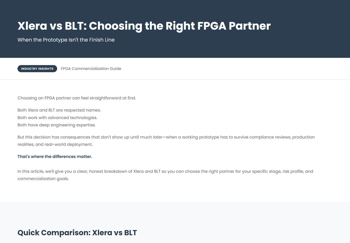
Xlera vs BLT comparison page: navy masthead, an Industry Insights pill, and opening body copy above a quick comparison section.

Xlera Solutions

Xlera vs BLT

A competitor comparison built to be findable and fair. Navy masthead, an "Industry Insights" pill to mark it as editorial rather than sales, and an opening that concedes the competitor's strengths before the differences land — the structure that makes a comparison page survive a sceptical reader.

  • Comparison page
  • Self-contained HTML
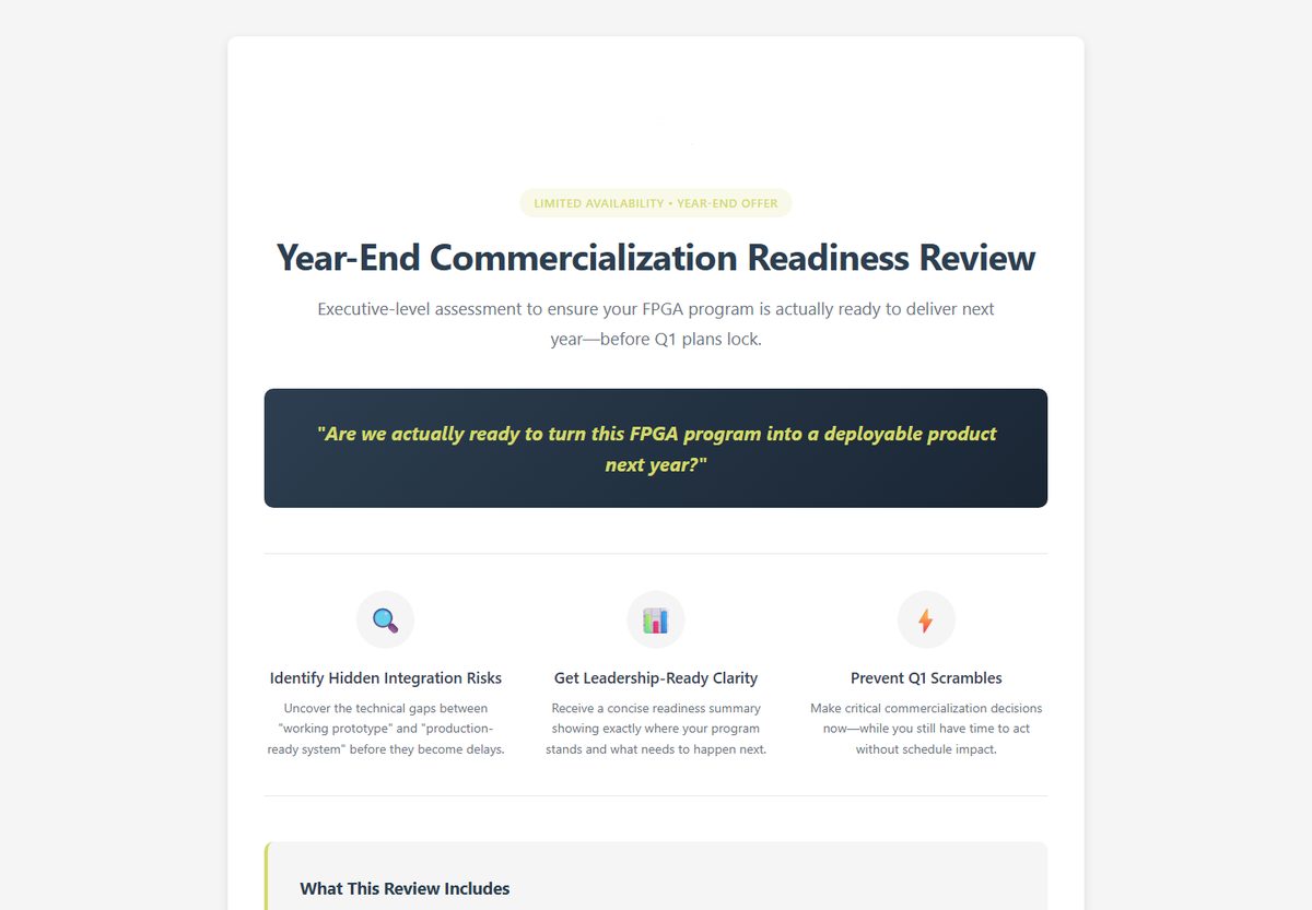
Xlera Year-End Commercialization Readiness Review page in the navy and lime brand system.

Xlera Solutions

Readiness Review & the offer set

A seasonal diagnostic offer, alongside the packages page, strategy-call page and newsletter templates — one navy-and-lime system stretched across a full funnel, every page self-contained so it can be pasted into the CMS without a build step.

  • Offer page
  • Part of a 12-page set

Let's talk about the build.

If something here is close to the problem you have, the fastest route is a short conversation about what the page actually has to do.